How To Use Brand Elements To Express Your Brand Personality

How fonts, colour and illustrations influence your audience
Just like a person, your brand has a personality – it looks, acts, and sounds unique. Or at least, it should.
Your brand personality is different from your brand goals or promise…when you think about personality, you’re thinking about the key characteristics that drive your brand’s tone, style and appearance – how you want it to be perceived, and what you want its relationship with your target audience or market to be.
Knowing your brand personality can help you make better decisions about what is and isn’t right for your brand, especially when it comes to your visuals, which have the power to evoke strong emotions in your audience.
For example, your brand personality might be: playful, optimistic, fresh and friendly.
Or, it might be: serious but approachable, knowledgeable, dependable, and trustworthy.
Just by looking at those two lists, you probably know intuitively what an ad from each brand might look like and – just as important – what it would not look like. That’s the beauty of knowing your brand personality – just like you can with a friend, you can quickly decide, “yes, they’d do/say/look like that” or “no, they wouldn’t”.

Brand elements like colour, fonts, and illustrations influence the feel of your message
As designers, when we choose brand elements such as colours, fonts, and illustration styles to represent a brand, we think a lot about the brand personality and how to create a visual style that will express it consistently across a range of needs. We also think about the target audience or market for the brand.
We use these elements to give our designs a specific mood and feel, and shape the audience’s emotional response to the brand. The right font and colour combinations can, for example, make a brand feel more trustworthy, friendly, or authoritative.
We usually give our clients options – depending on the size of their organization and the number of different audiences they communicate with. We sometimes offer pairs of fonts, for example, with rules for using them to create different feelings in different contexts (depending on the message’s content, tone and audience). What works for one target audience, might not be appropriate for another.
For example, a client might have one font for a more serious, corporate message and another for a more lighthearted approach. For a colour palette, they’ll usually have a primary brand colour, a secondary brand colour, and then an accent colour or two with which to add interest to the page, or anchor text. We might give them both a dark and a warm overlay for their photos to create different moods.
Then, before we begin to design even something as simple as a social media post, we make sure we know the answers to the following questions:
Who is it for?
What is it for?
How can we use the brand elements to express the appropriate tone, evoke the right feeling, and support or amplify the message?
Brand colours evoke emotions
Colours are one of the first things people notice in a design. The emotion evoked by a colour is often subjective and subconscious – one person’s depressing blue is another person’s calm ocean. Red can feel angry and irritating in some applications, and energetic and celebratory in others – when it comes to colour, context is everything.
Look what happens below when we swap in red, yellow and orange for the serene blues and greens we used in a physiotherapy clinic’s logo. It becomes an anxiety-inducing fireball of energy – not the feeling we want to evoke for a client in the health, healing and wellness sector!

In fact, when we designed the colour palette for Jericho Physio, we chose our blues for their qualities of expansiveness, trust, professionalism, and sensitivity. We paired them with greens that radiate renewal, growth, energy, freshness, and harmony. The choices are a fit for a brand personality that is nurturing, knowledgeable, calm, connected, and experienced – and they help to create a soothing, welcoming environment for clients, who may be sitting in the waiting room in pain.
Brand fonts establish the feeling, structure and voice of a page
Each font has a unique feel and purpose. Some are the easy-to-read workhorses we use for body copy and paragraph headers, others set up expectations about the tone and content of the material, or are used as decorative elements that provide visual relief on the page.
Fonts provide visual cues for the page’s information hierarchy. For example, we’re trained to read “bold” as important and traditional serif fonts as authoritative and intellectual. Using combinations of font styles and weights, we can guide an audience through the page, from the most important message to the least.
For our independent school client, Southridge School, we chose a range of fonts that they can use for everything from lighthearted pieces in their school magazine, to material that is academic in tone:
Brandon Text font (sans serif): Professional, versatile, and friendly, we use it for headers and clean body copy.
Hello Beautiful font (script): Playful, elegant and strong, we use it as an accent font in headers, to highlight a quote, or for a call-out within text.
Scala font (serif): Professional, academic and traditional, we use it in internal or professional communication.

Look at the two examples below. On the left, you can see how we use colour and fonts in Southridge’s Spirit Magazine to set the tone of each article, separate blocks of information, evoke emotions, and guide the reader through the page. The fonts reflect the school’s brand personality as a values-oriented, supportive, creative and high-achieving organization. The style is meant to resonate with the magazine’s audience, who are also values-oriented, community-focused, and interested in both academic achievement and service.
When the fonts are applied incorrectly the effect is flat – the page loses its approachability and playfulness. It’s less interesting and, therefore, less likely to entice readers.
Our font choices for a property management client’s business proposals take a different approach. The audience for Transpacific Realty’s proposals is focused on getting the information they need to make a business decision.
All fonts are easy-to-read and are structured in a hierarchy that anchors the reader and makes the information easy to scan. Each page feels clean, well-organized, and business-like. The corporate blue on the page is drawn from their logo and offers visual relief, as well as an organizing principle.
See what happens below if we swap out Transpacific’s usual font for Southridge’s, and discard the different font weights and colours. The effect is disorienting – there’s no “path” through the information – and the tone is no longer business-like. The information-heavy pages become a daunting read, lessening the chance that Transpacific’s full offer would be communicated to a prospective client.

Illustrations add personality to words
Illustrations can strongly influence the feeling of a piece. Like a photograph, an illustration tells a story, sets a tone, and establishes a feeling or mood. Often, you can say more with an illustration – or evoke a bigger feeling – than you can with words alone.
The illustrations we create for Barnside Brewing Co.’s craft beer labels and packaging are often nostalgic in both style and colour – and tell a story about the land, the farmers who work it, and the weather that rules it.
It’s a fit for a brand whose personality is proudly rural, local, nostalgic and authentic. When you see the cans in the store or tasting room, the illustrations tell you the story of the beer: where it comes from, the farming history behind it, and its authenticity as a locally crafted brew. For craft beer drinkers, interesting stories and the labels that describe them are part of the journey of discovery – and a perfect fit for an illustrative treatment.

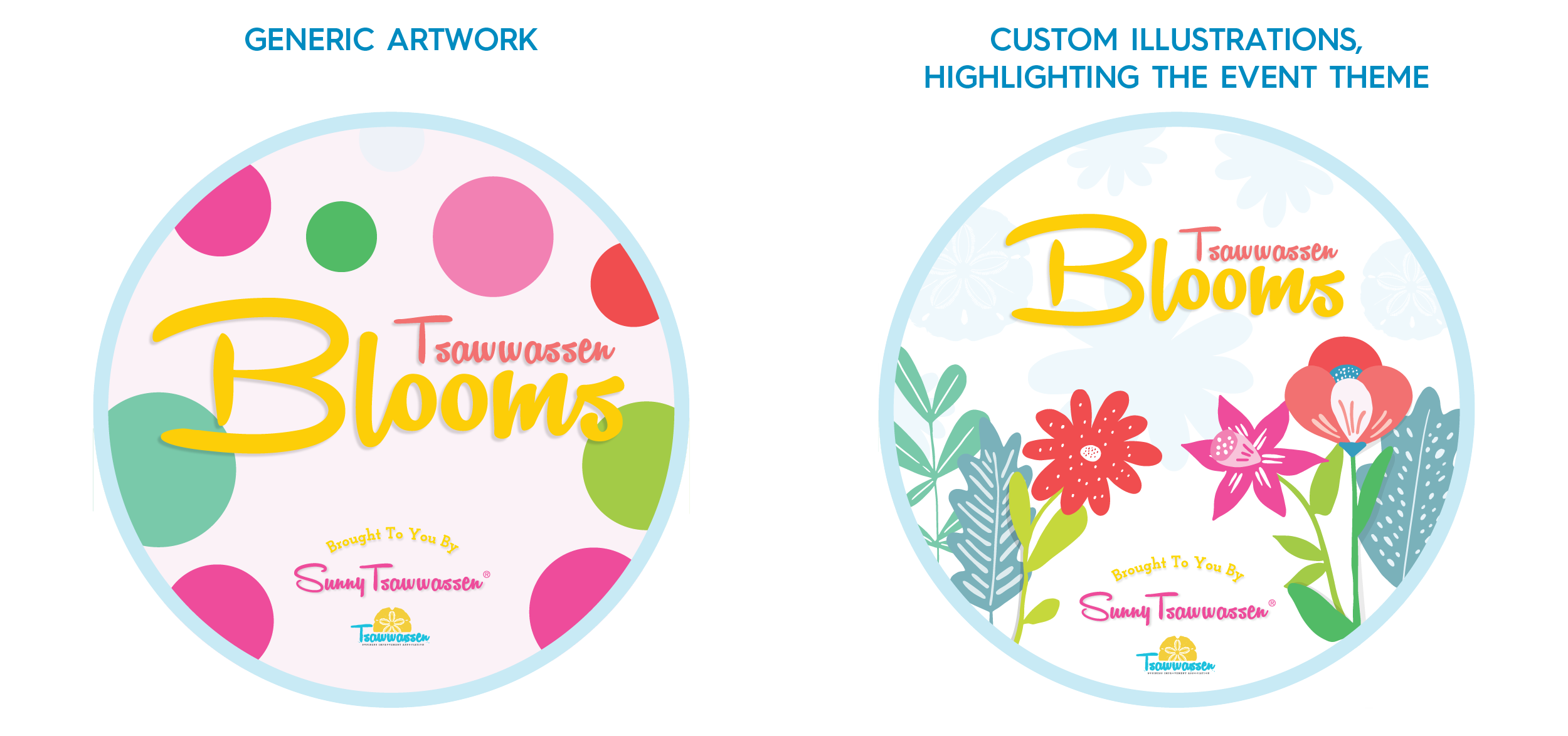
The difference between stock and custom illustrations becomes clear in the examples below from the Tsawwassen Business Improvement Association (BIA). The stories told by both the decal and the map become more specific and expressive with custom illustrations – they tell a bigger story and invite the reader to linger and examine them. (And we were able to use the map illustrations to create a fun GIF for the BIA’s social page!) The Tsawwassen Blooms campaign was created to attract people to the area and into the shopping district. Its tone was playful, positive, and full of summer fun – another great fit for an illustrative treatment.
Design with intention for your target market
We’ve shown you a handful of ways to use design elements like colour, font, and illustration to influence the user experience and more fully express your brand personality. The key to all of this is to design with intention.
Choosing a playful illustration for your serious brand is like hitting the wrong note in a song; it creates dissonance – and creates a question mark, however small, around your identity. Remember the key questions: who is this message for, what is it about, and how can I evoke the right feelings, and make the desired connection, while remaining consistent with my brand personality?
Looking for more ideas from StudioTalk?
StudioTalk is our free, quarterly newsletter full of practical design, branding, and customer relationship-building ideas to help you grow your business.